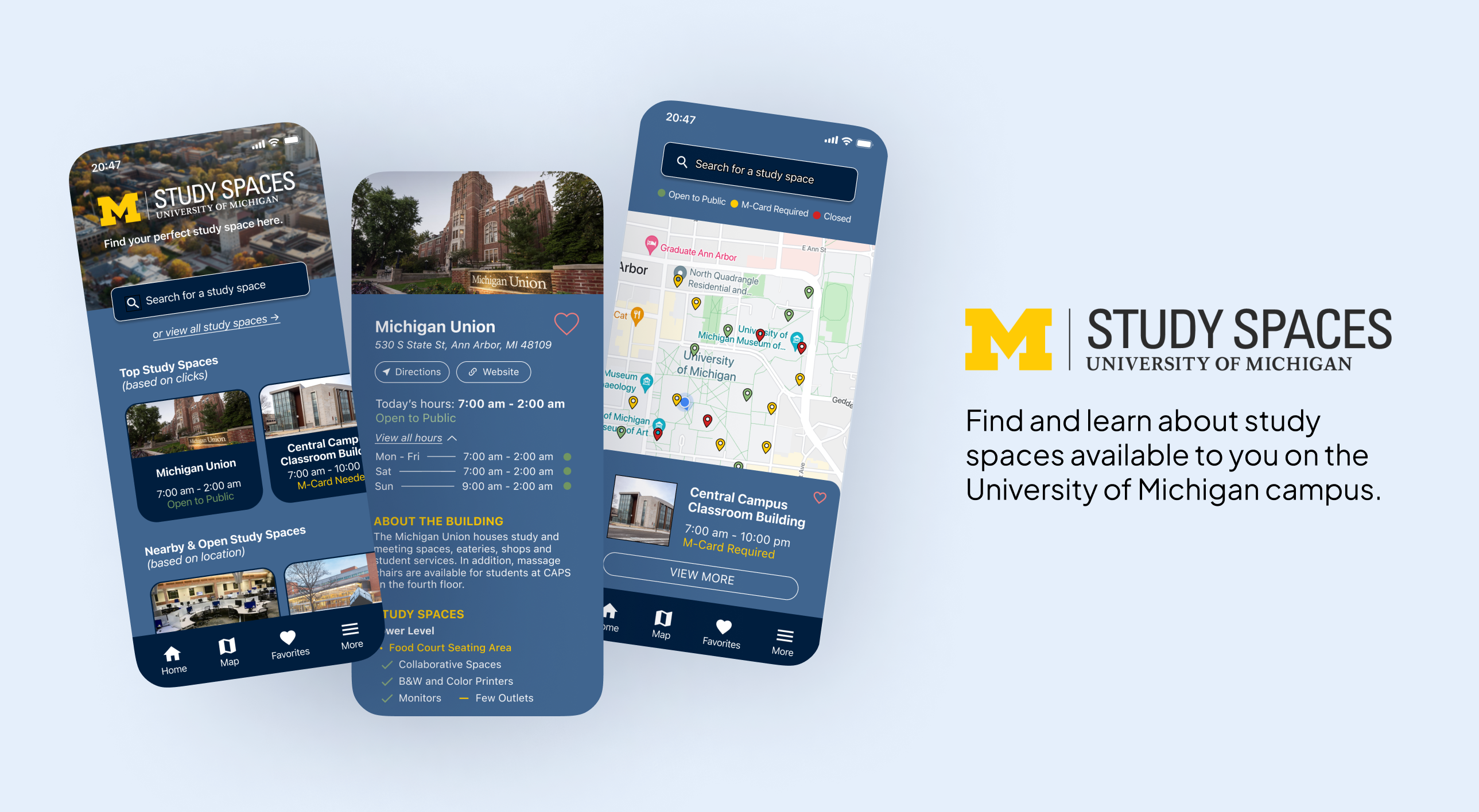
U-M Study Spaces
Whether you're a student or a guest, find and learn about the study spaces available to you on campus, whenever and wherever.
Role: Product Designer + Product Manager
Skills: User Research, User Interviews, Persona Creation, Wireframing, Prototyping, Usability Testing, User Experience Design, Agile Project Management, Pivotal Tracker, Figma
Timeline: Mar 2022 - Apr 2022 (5 weeks, class project)
The Problem
University of Michigan students want to know which study spaces are available based on their preferences and time of study so that they can reduce the time spent searching the campus for open locations.
How might we improve access to information of study spaces on campus?
The Solution
When looking for study spaces, each person has their own requirements, but the problem most students share is the study space being closed or locked. The U-M Study Spaces app addresses this problem by providing users direct access to information about nearby and available study spots as well as their opening hours (including if it is open to the public, locked to U-M students, or closed as a whole).
Competitive Analysis
The largest competitor is navigation apps, as some may ask why not just use those to locate hours. However, the opportunities of this app come from filling the gaps of navigation apps given a student perspective. For instance:
- Navigation apps may not necessarily reflect the building's accurate hours, since the university often changes the hours based on certain events or staffing.
- Navigation apps do not list when the buildings are locked to M-Cards, meaning a guest may try to enter the building due to it being “open” on their navigation app but it is actually locked to them.
- Navigation apps lack information about the study spaces available in buildings, as well as other information, such as if the building contains food and is suited for group study.
Target Audience
All personas created include basic demographic information, traits, goals, needs, challenges, and pain points that guided me in designing the product..
Primary Audience: University of Michigan students
All students will benefit from this app because it provides valuable information about buildings and possibly new insight into the available study spaces and corresponding amenities.
Secondary audience: New U-M students and U-M guests
Those new to campus (e.g. freshmen, transfer students, guests) do not know of the study spots available nor the hours - especially ones with inconsistent hours. This app would help them find open spaces and understand if they can be loud or quiet.
Persona Profiles
These persona profiles were created based on initial user interviews with students and background knowledge.
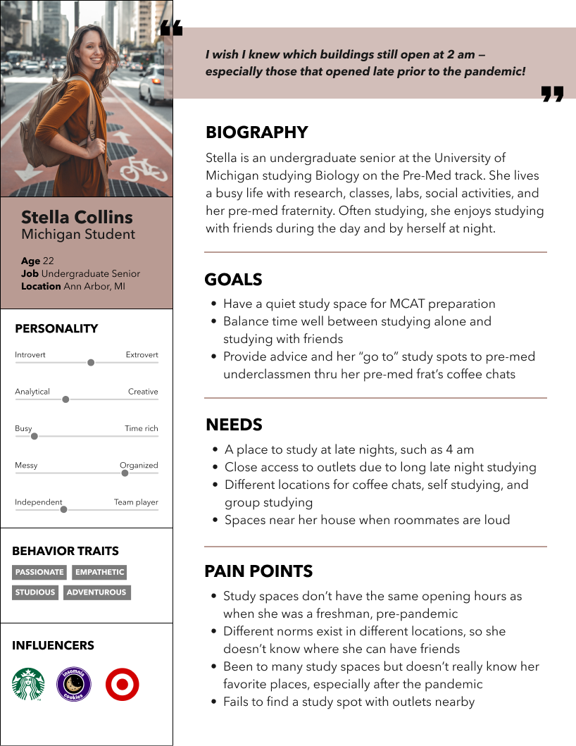
Primary Persona: U-M Student
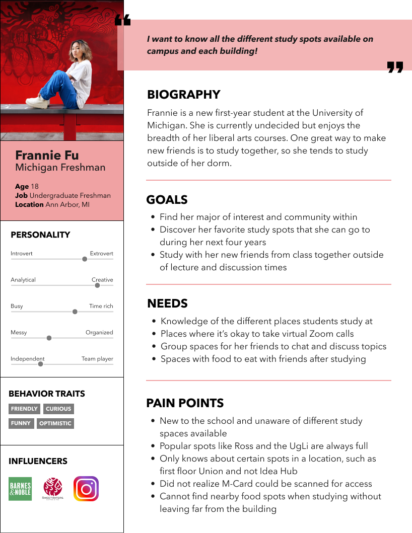
Secondary Persona: New Student
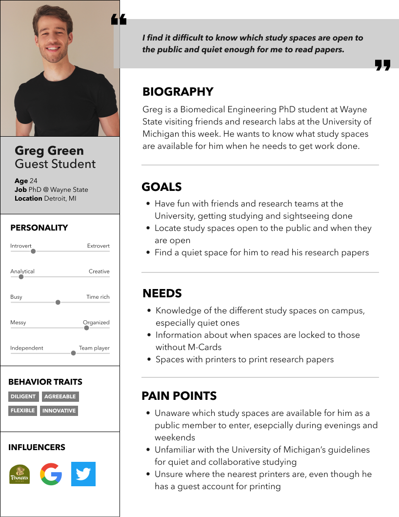
Secondary Persona: Guest Student
Digital Product Design Process
Project & Product Management
Prior to designing, I listed the categories I would want to hit for each building on a document - from noise level to food availability. I also included all tasks on Pivotal Tracker, my project management tool and product requirements document. Each task was ranked on a Points of 2 scale with an approximate velocity of 6 points per week (length of sprint). Each screen received a specific epic (home, map, individual building view, and more page), and I included epics for conducting user testing and building use cases and personas.
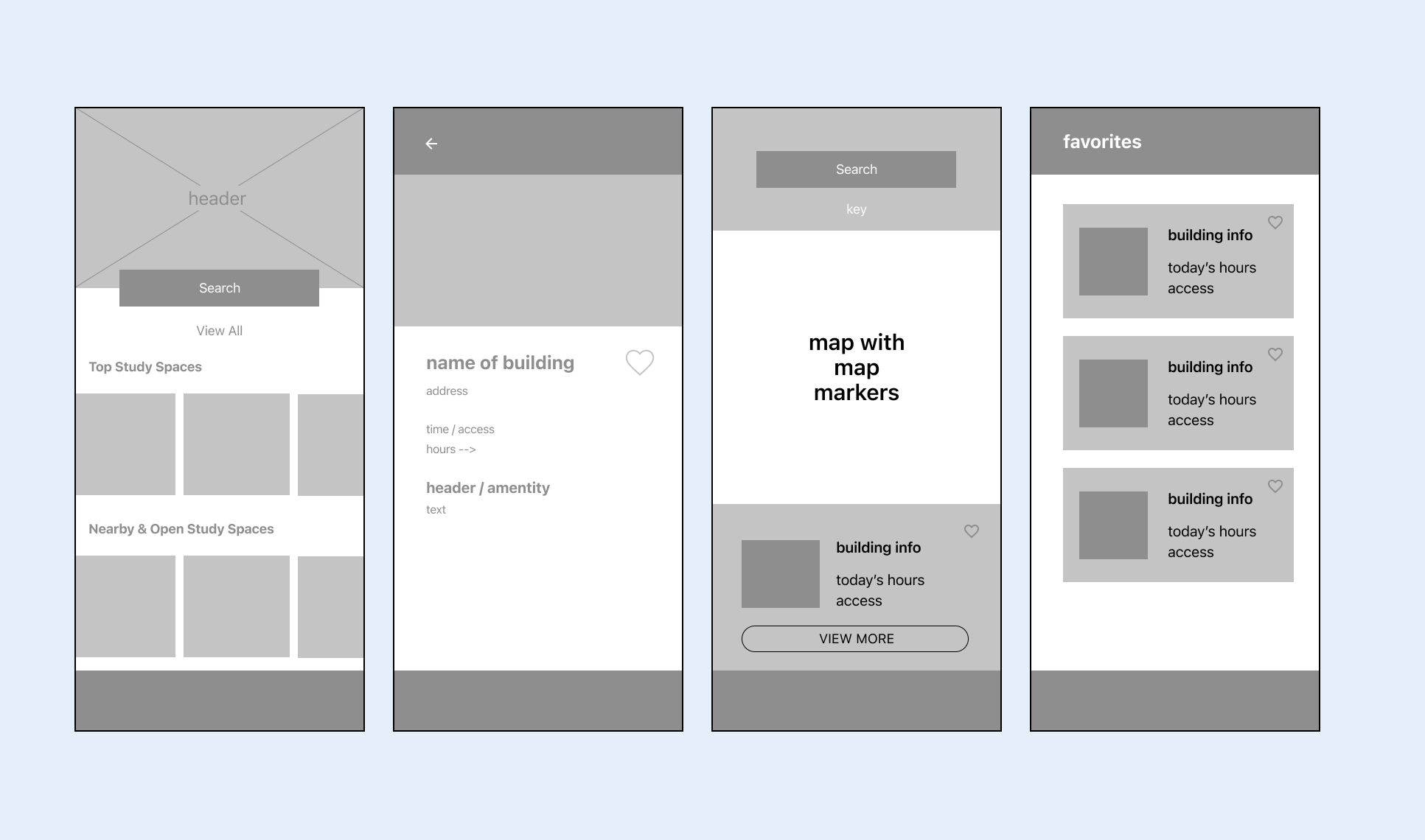
User Feedback & Wireframing
Sharing my idea with classmates, I learned that students wanted something that is fast and concise, so I removed parts inessential to the problem statement, such as creating an account.
After wireframing the main pages, I completed 3 interviews with students to learn about their pain points with regard to study spaces.
The main themes were:
- Not knowing the study spaces that exist
- Not knowing when the study spaces were open
- Not knowing if virtual meetings can be taken there
I combined my insights from user research with the goals/challenges of personas, deciding the top factors — beyond hours, location, and access — are opening hours, outlets, quiet/collaborative norms, printers, and food.
Usability Testing
Once I completed a high-fidelity prototype, I tested the app with 3 participants. There were 6 role-based or scenario-based tasks with some followup questions. Examples include:
- I want you to think about if you were a student on campus with a valid M-Card unsure of where to study at this late evening time. Can you show me which study spaces are near you right now?
- This test shows how users try to find the list of available spaces, and if the user understands the map legend.
- Go back to the homepage. Navigate to the [building page]. What did you learn?
- The user could use the homepage, search, or map to find this page, so this test shows the method users like to use. It also provides insight to what on the page is most important to them.
- Now imagine you are not a student. At what times can you enter the [building]?
- This question tests the format of hours and legend on the building page, as well as understanding the different personas.
- You can't find what your Michigan friend recommended. How do you leave feedback for the app administrator?
- The user should notice the "more" page on the app and provide their thoughts on the feedback form.
Within each task, I noted if the user completed the task without help, the approximate time it took, the path the user took, and any other verbal comments. I included what users first click on and the icons they go towards. For one, many users wanted to click on the favorite icon, but felt that the animations were choppy and had a lack of readability within pages. Users also noted that this would be an app they'd use and "would have been very helpful during the beginning of the year". It is also important to note that while I did provide background to the app, all testers were students and thus had prior knowledge on study spaces.
Acting on this feedback, I polished my design from paragraphs to check-based bullet points and toggle menus. I also improved the prototyping of favoriting buildings and transitioning from one page to another.
Rationale Behind Design Decisions
It is common to see students walking around campus with their phones in hand. With that, a mobile app that shows the different buildings available based on nearby location and open hours would be essential.
Realizing that students are time-efficient people, these are some major decisions I made:
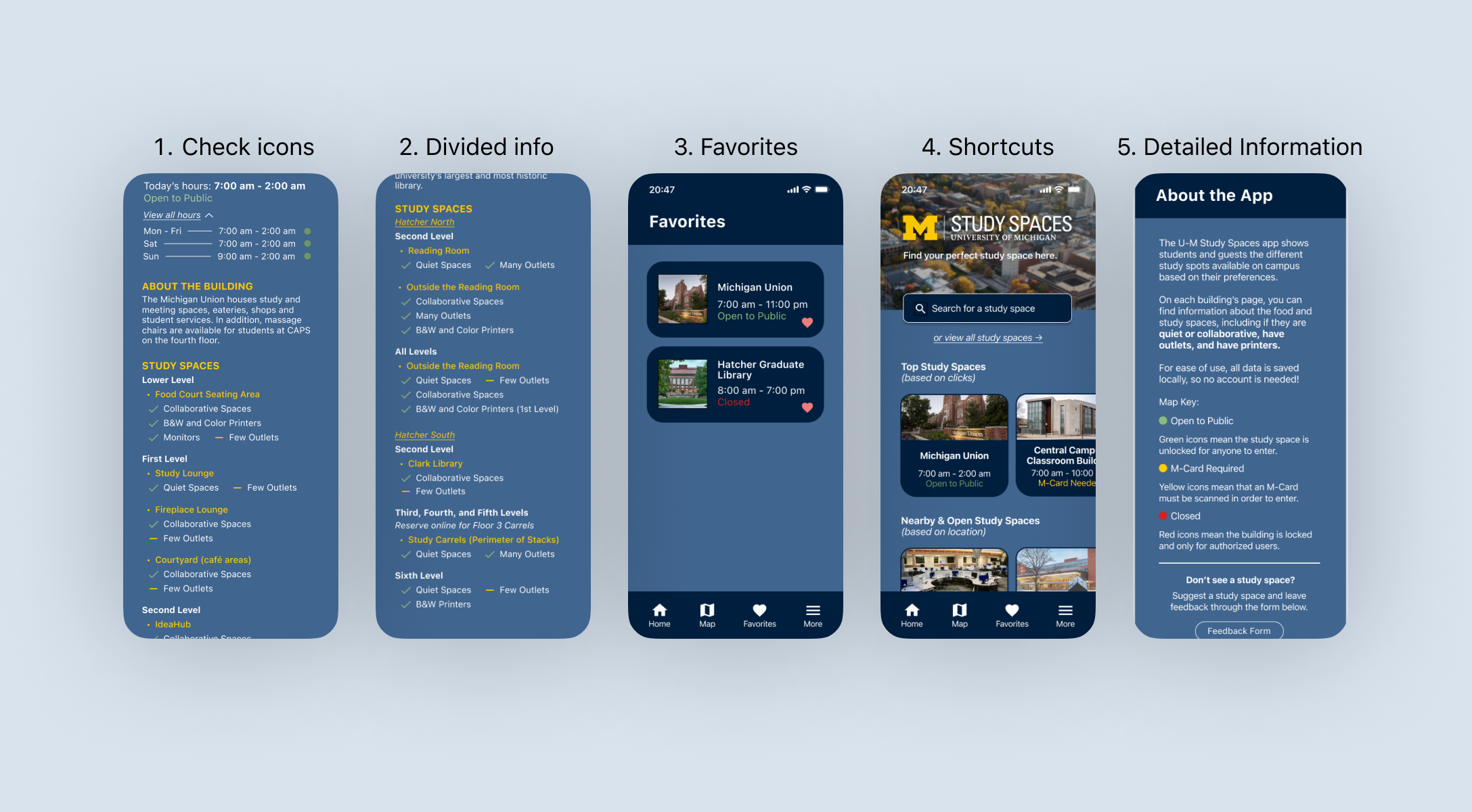
- Check icons for easy readability
- Divide information by floor level
- Access favorites easily
- Shortcuts to search for buildings and find study spaces (nearby, popular)
- Map legend and feedback on a separate page
Inspiration
Within Jakob Nielsen's 10 Usability Heuristics, Heuristic #4 is Consistency & Standards. This app takes inspiration from Yelp, Google Maps, and M-Bus - all apps that students tend to use. In addition, all colors are from the University of Michigan's brand kit to keep the branding consistent among U-M apps. Maintaining consistency within search buttons, favorites, building view, colors, and homepages increase user learnability.
Next Steps
The product stands as a version 1.0 SLC (simple, lovable, complete) product with capabilities to expand. Potential areas of expansion:
Outdoor Seating
When the weather is warm in Michigan, there are many opportunities to study outside! It would be beneficial to have a feature to show which study spots offer outdoor seating and if it is limited.
Sharing & Availability Features
My target audience includes U-M students and guests. With a share option, students could share a building location and its amenities with a guest through a messaging platform. Users can look at the info without creating an account. With engineering bandwidth, I would also love to add a feature that monitors how full the study space is. This would help better guide students, whether individual or group, to a suitable study space, especially during exam season.
Filter/Sort Features & Overall Refinement
Once there are more features and the most essential features are identified, it would be nice to filter and sort through features on the map. As more features are added to individual pages, I would change the design so that there are openable menus for each study space, making the design more clean, concise, and readable.
Reflection
This was my first solo design project where I gained experience in end-to-end product management, product design, project management, and user research. It was a valuable experience to apply my learnings from ENTR 390: Digital Product Design. This idea was generated from what my peers would tell me — so this project really showed me how to use empathy for my design decisions. Writing the market requirements and product requirements documents also allowed me to implement business knowledge. Since this was a large project within five weeks, here are some of my learnings and what I would do differently:
- Receive feedback earlier (by multiple people, and multiple times). In the beginning, I ran leap-of-faith assumption tests and user research interviews, and after my MVP, I ran usability tests. Both of these were important in deciding my app's features and design decisions. However, if I had asked for more structured feedback in phases, such as after my wireframe and lo-fi prototypes, I could have implemented those users' thoughts prior to my final design. Of course, time was a big limitation in this project.
- Prioritize features before starting the design. I first came up with many ideas for this app, including sign-in, sharing, weather, and filtering. However, once I inputted all these ideas into Pivotal Tracker, I was quick to realize that I did not have the time for all of these design elements, given the timeframe of this project. I had already created different wireframes, but going forward, I know to make sure I mark which features are required and which are optional for my minimum viable product. Because of this, I have a label for "future releases" features in Pivotal Tracker, which can be seen in the image under the PM section of this case study.
- Maintain design hierarchy and accesibility. Especially on the individual building pages, information started to rack up and it was difficult to maintain hierarchy between headings, subheadings, icons, and text. It would be interesting to add and test toggle menus and different colors. Overall, I would have liked to do more competitive research to see how other similar apps showcase lots of information like this app. Upon taking a class on web development accessibility, I would also complete an accessibility test on this app, including color contrast and ease of navigation.
Overall, this was a really fun first solo project, and I am grateful to have had the opportunity to learn about and apply the product development process on a topic so relevant to me.